Farmers Weekly
Classified
Introduction
Farmers Weekly Classified is an online marketplace specialising in buying, selling and hire of new or used farm machinery and equipment. When brought onto the project, the website was outdated, was not mobile friendly and had many well documented issues proving to be a frequent source of frustration for our users.
Combined with increased competition in the market, these issues were thought to be contributing to a decline in our number of monthly active users. My role was to reverse this trend via a site redesign, creating new responsive layouts and introducing new functionality.
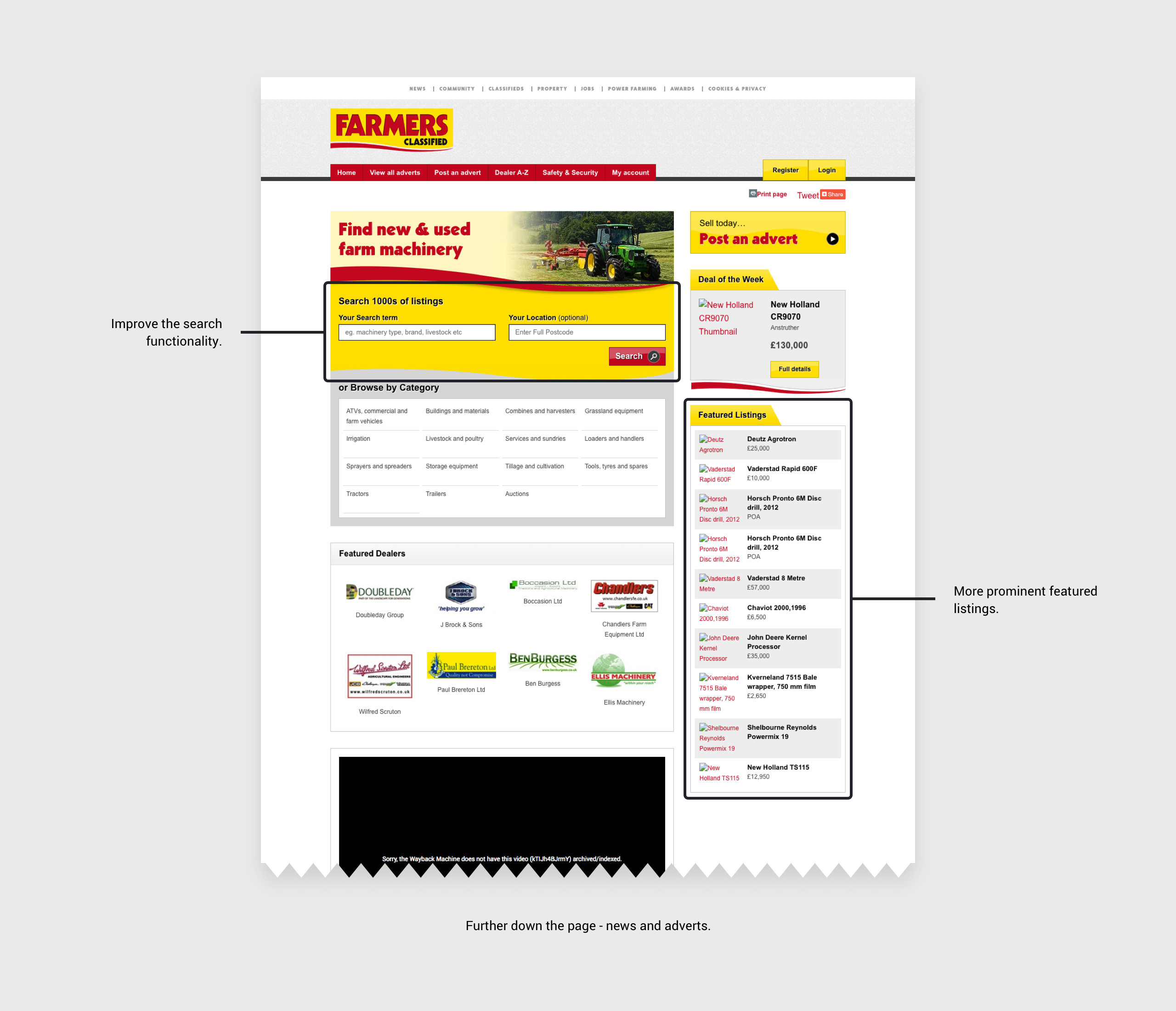
Original site homepage detailing some initial requirements gathered from stakeholders.
Understanding
I started by reviewing current personas and conducting interviews with members of our sales team. This helped me to better understand our user needs and their pain points as well as what the sites main problem areas were. Equipped with this knowledge, I assessed the current structure of content and information by creating a site map whilst also highlighting the key areas targeted for improvement.
Key issues with the site included the following:
- Difficulty finding items of interest due to broad results set.
- Difficulty filtering results.
- No way to compare or save adverts.
- Drop-outs during the ‘post advert’ process.
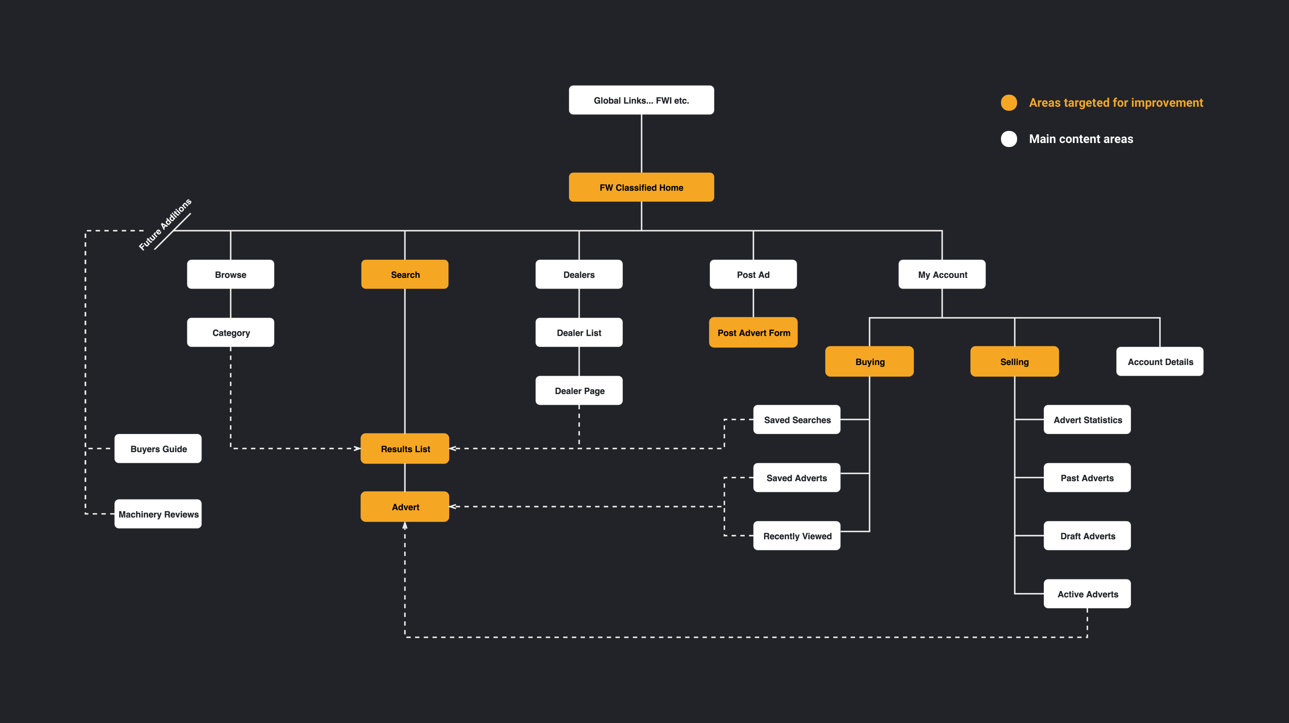
Site map created using draw.io
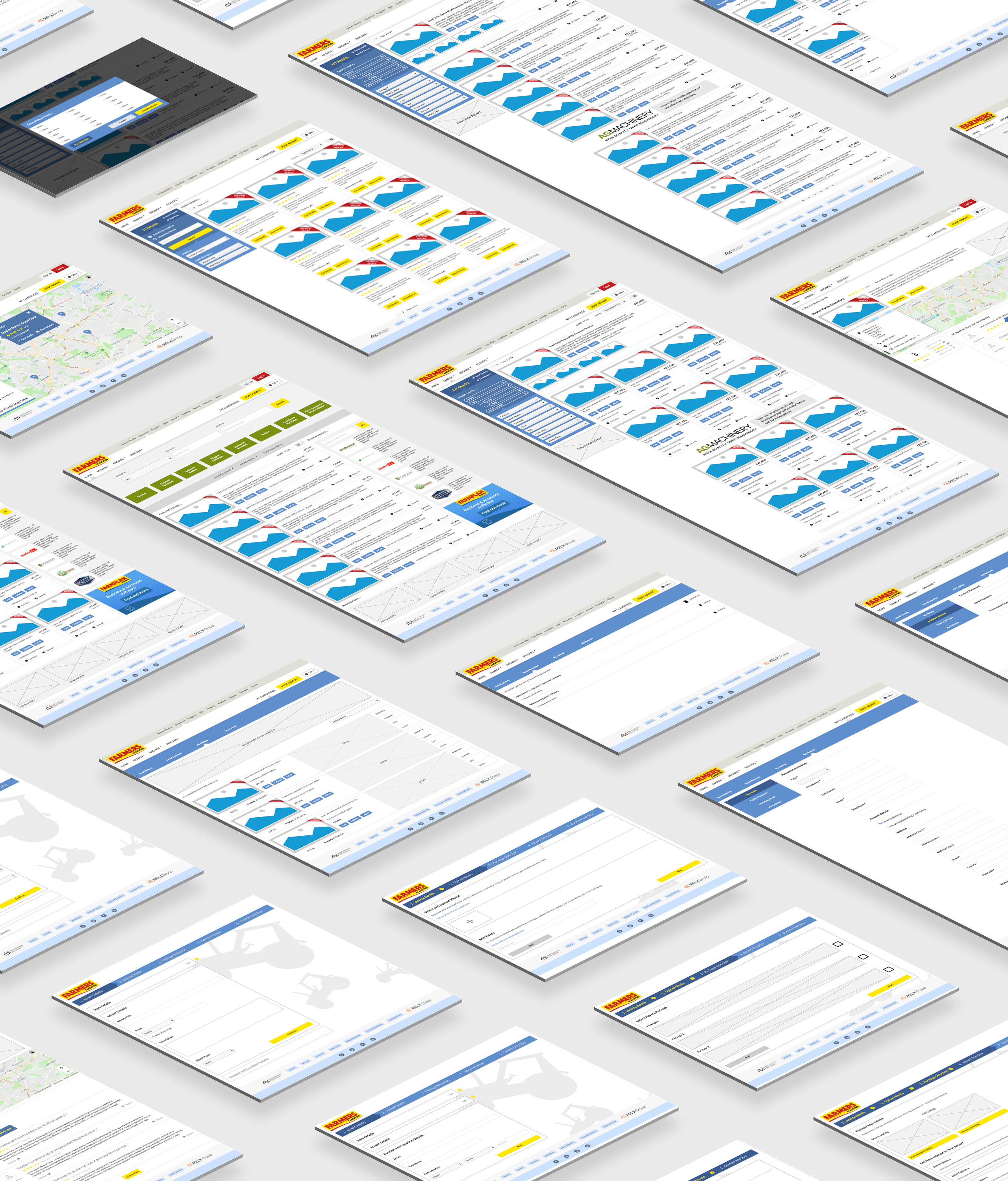
Wireframing
I created a number of low fidelity wireframes to illustrate potential responsive layouts and communicate these to the relevant business stakeholders. This allowed me to collect feedback quickly and iterate rapidly. Rounds of wireframing and internal testing led to improvements to the design and an informed decision on which layout we would take forward to test with customers.
Initial improvements included:
- Having a far more prominent search area with the inclusion of a ‘Category’ to narrow the result set.
- Only displaying the most used categories for the ‘Browse by Category’ section.
- Allowing more screen real estate for the featured adverts and placing them directly beneath the search.
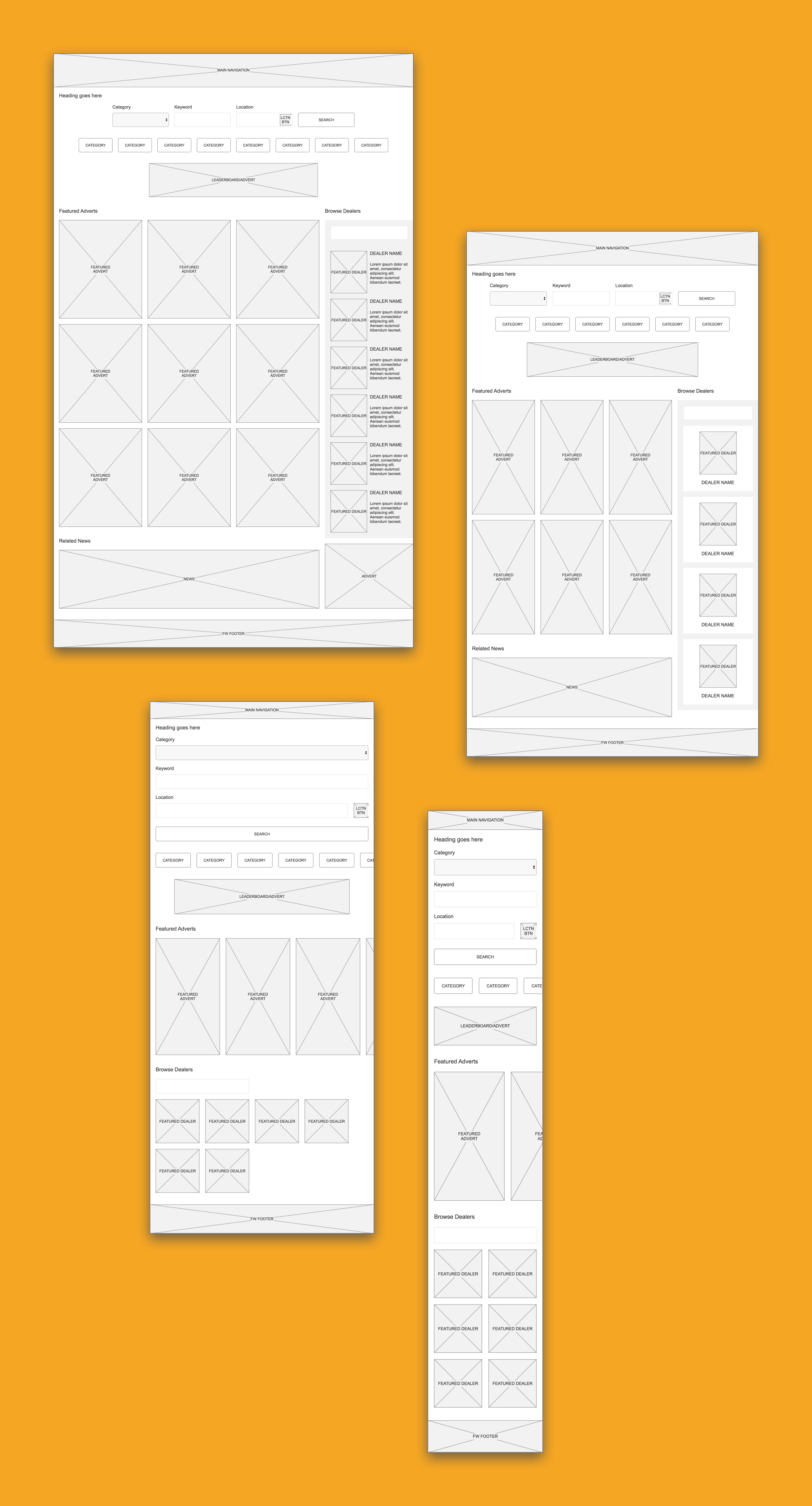
Desktop, tablet and mobile wireframes created using adaptive views in Axure.
Prototyping and testing
Moving into a prototyping and testing phase, we aimed to validate our assumptions on the proposed layout. This involved creating mid-fidelity clickable prototypes in Axure to convey the key user journeys and further explain details of the design. One prototype was created to illustrate the desktop user journey with another being created for mobile.
Testing the prototypes revealed some key insights:
- Users prefer to perform an initial search using ‘Category’ and ‘Make’ criteria as opposed to a keyword.
- Users happy to pre-filter results further which lead to the inclusion of min/max price criteria.
- Being able to ‘favourite’ adverts was a must have.
Examples of the desktop screens from the interactive prototype.
Desktop prototype in action.
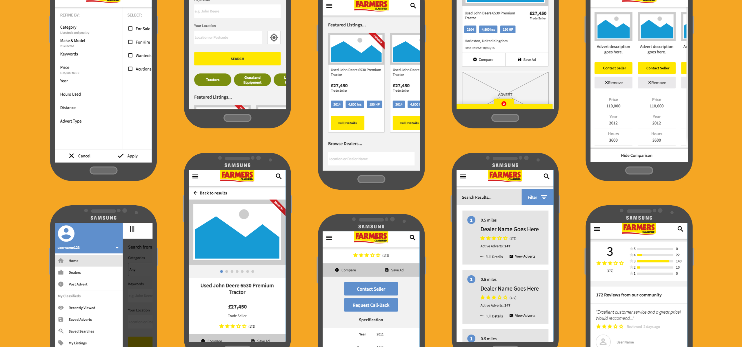
Examples of the mobile screens from the interactive prototype.
Interactive mobile protoype... give it a go!
Visual design & style guide
Following a couple of rounds of testing I progressed to creating a final design that would incorporate the necessary changes. I had to produce visuals for all of the main screens in desktop, tablet and mobile formats. Using Sketch and InVision I worked through many design iterations allowing internal stakeholders to view progression and provide feedback throughout.
I ended up maintaining approximately 100 screens in InVision, roughly 30+ screens per format.
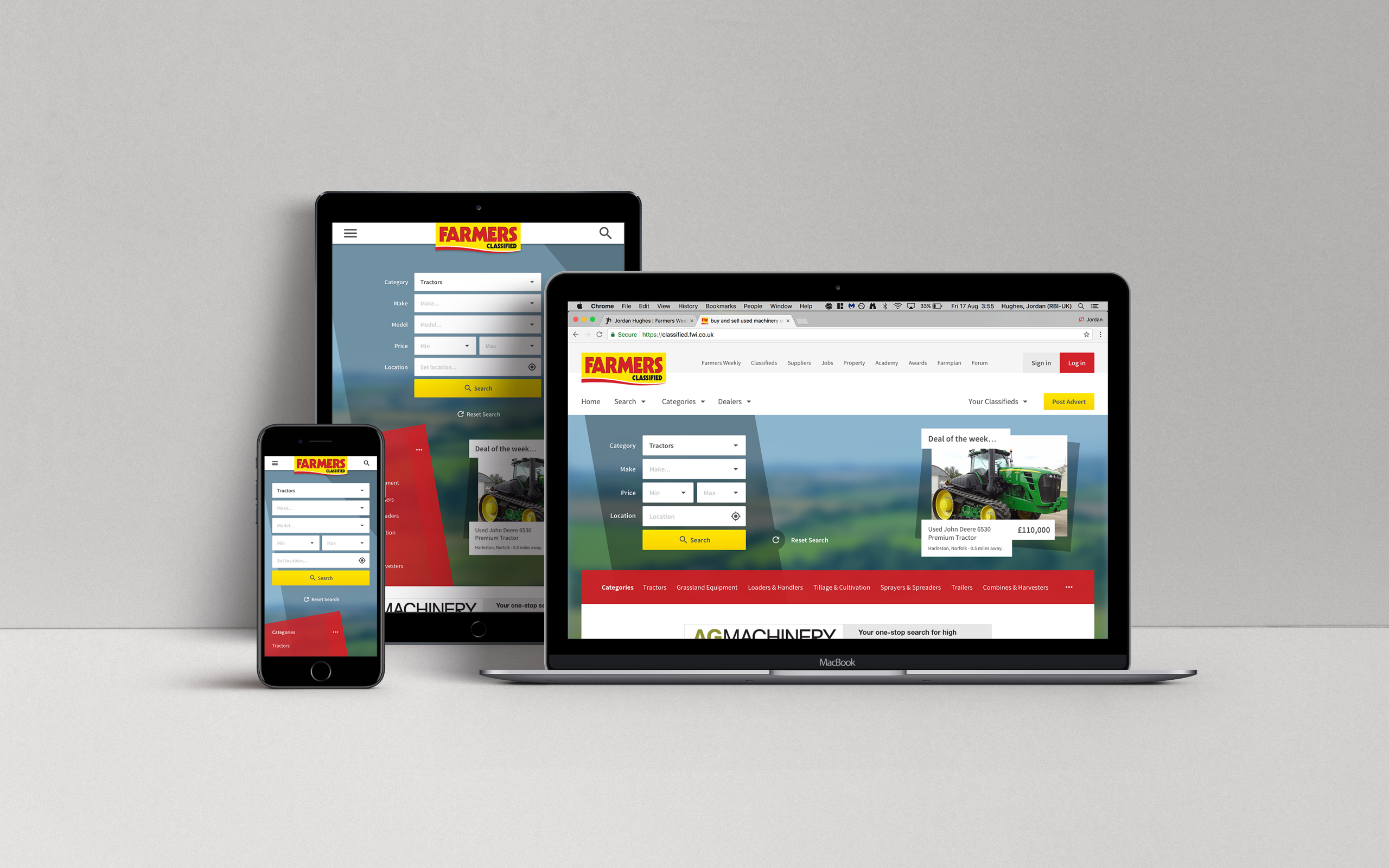
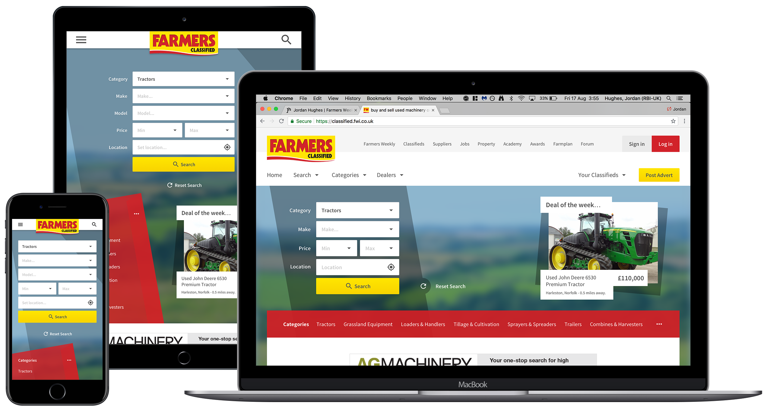
Examples of the redesigned home screen on desktop, tablet and mobile.
The final design retained colour schemes from the previous site to aid user recognition and provide clear association with the Farmers Weekly brand. The design would also allow better monetization of promotions such as ‘Deal of the week’ by giving them far more weight and prominence.
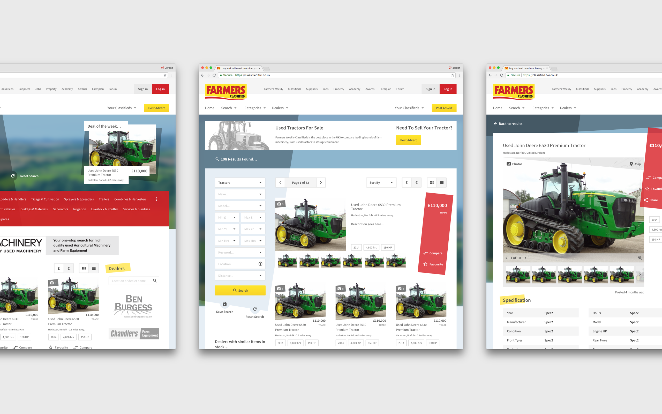
Home, results and advert pages.
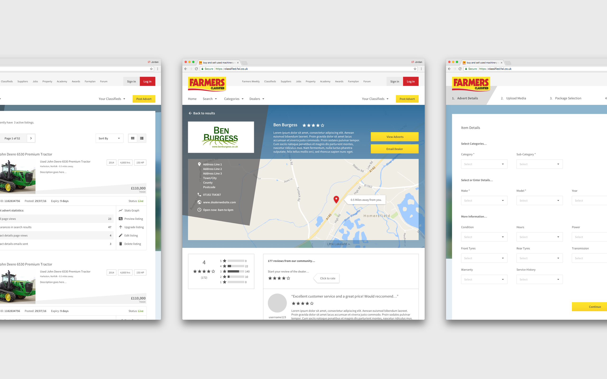
Active listings, dealers and post advert flow.
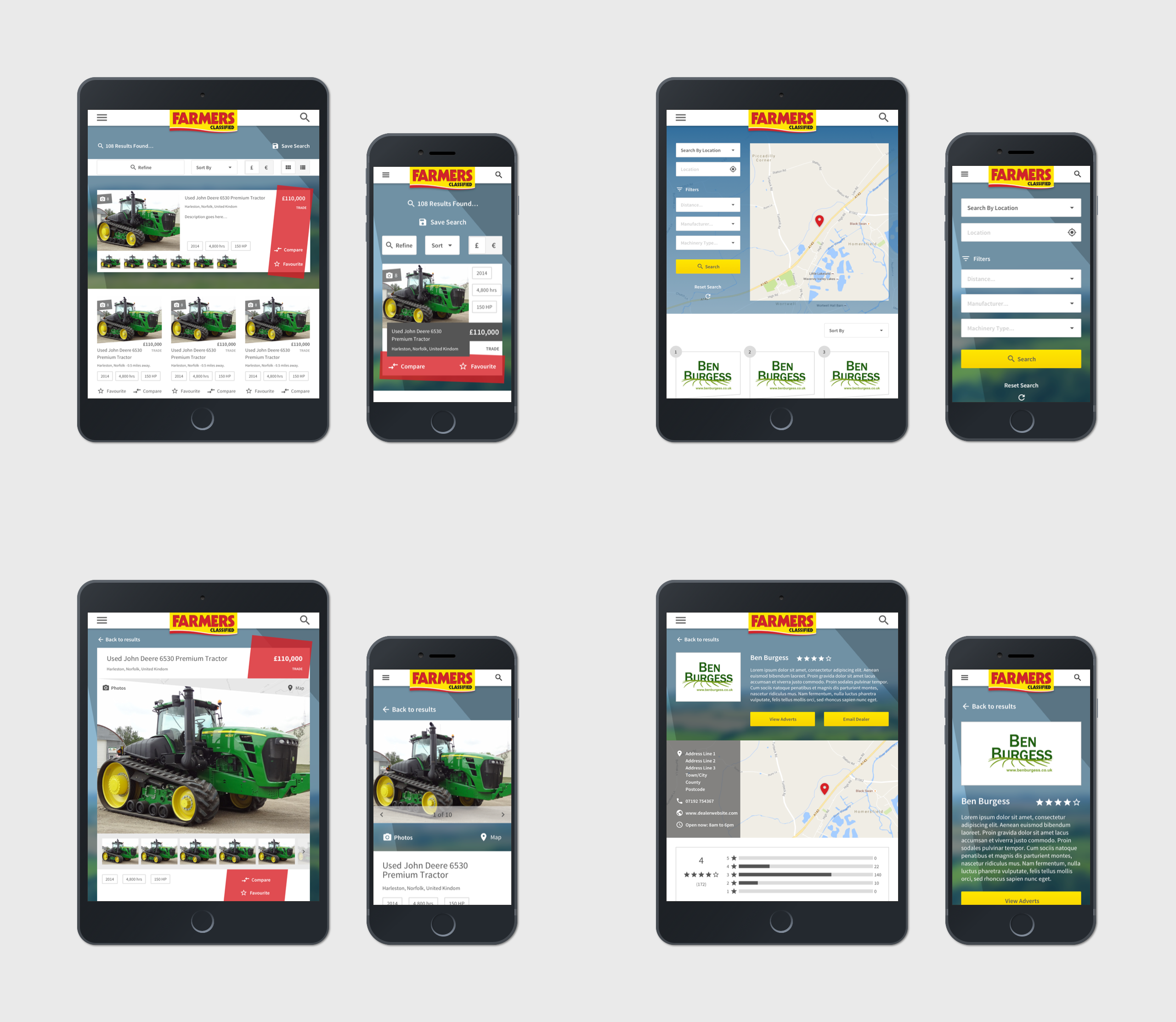
Some examples of the tablet and mobile screens.
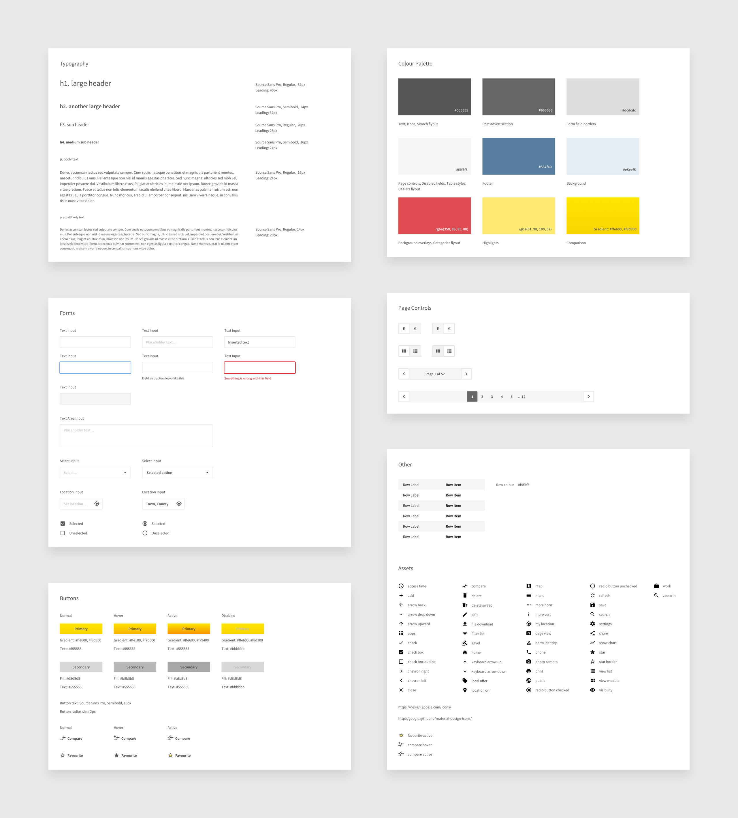
Lighweight styleguide delivered to development team.
Reflection
Due to the project timeline I was forced to progress to the visual design stage quickly where I ended up spending lots of time managing polished, pixel perfect visuals. I would have liked to have been able to spend more time early on in the project testing lower fidelity designs and speaking with more end users. I feel this would have helped to better understand priority of new functionality and identify which would be key for customer retention.
In the end the designs were adapted and used for another Farmers Weekly offering, their farming land and property platform. You can view the live site here.